Submitted by Mariko Sugita
Urban typography: a glimpse into a world of local typefaces in Japanese cities, and their survival
Japan Architecture News - Apr 02, 2019 - 06:06 23550 views

"Human experience and a mode of living take on the material and spatial form. Typography in our urban space, too, reflect the unique character of space and people who live there," said Rintaro Shimohama, one of the directors of the NORAMOJI Project.
We barely pay attention to the typography in our cities that dress up everything from storefronts and street signs to train stations and office buildings. Architects and urban planners, too, don’t usually pay much attention to what kind of typefaces are to be used to adorn their design and creation.

However, a lettering style, the typeface of logos and signage do not deserve its neglect, as they cover a considerable amount of urban surfaces. When you exit from an airport and get on a taxi to downtown in a foreign country, it hits you that you are on a foreign land when you start seeing how the signs, storefronts, and advertisements are written that are not familiar to you. You would recognize the iconic Helvetica letters in a New York subway station, or Illuminated Neon Street Signs in Hong Kong. They, too, contribute to shaping the city’s identities as much as the other factors like urban infrastructure and architectural types.
The art of typography in urban spaces
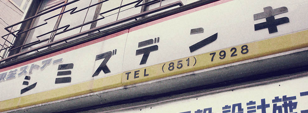
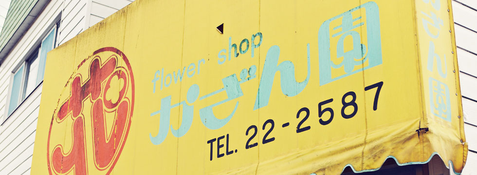
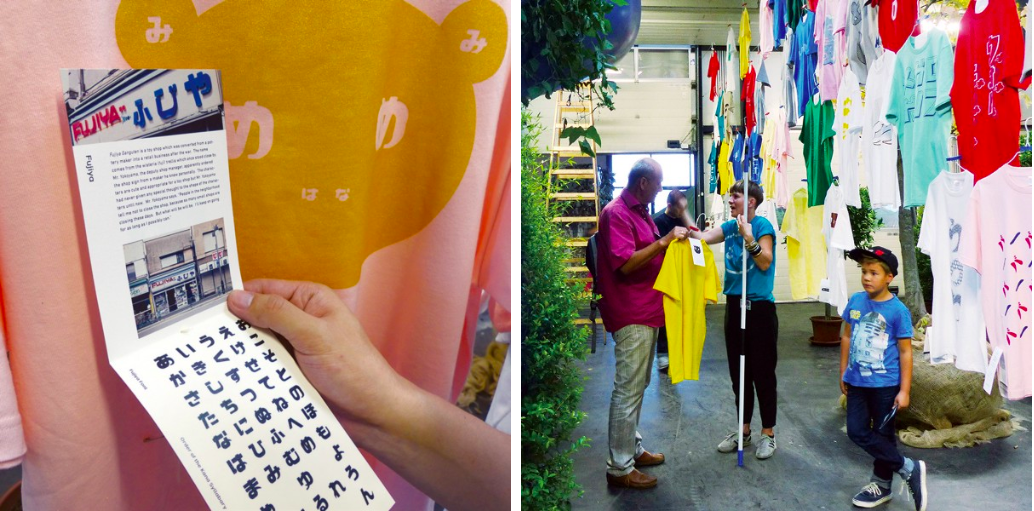
Japan-based NORAMOJI Project knows how much typography matters. They pay attention to fonts that appear in storefronts in old neighborhoods in Japan. They especially have a care for fonts that are handmade, unique, and even imperfect - that are created by shop owners and non-designers. "They might not be sophisticated, but they have their own charm and uniqueness," Naoki Nishimura, one of the directors, says.
They name these charming, yet neglected typographies in a city as “NORAMOJI”. “Nora” means “stray” in Japanese, and “Moji” means “text” - thus, NORA-MOJI means “a stray font” (just like a dog and cat!), indicating minor, unofficial font that doesn't have an official title or usage.
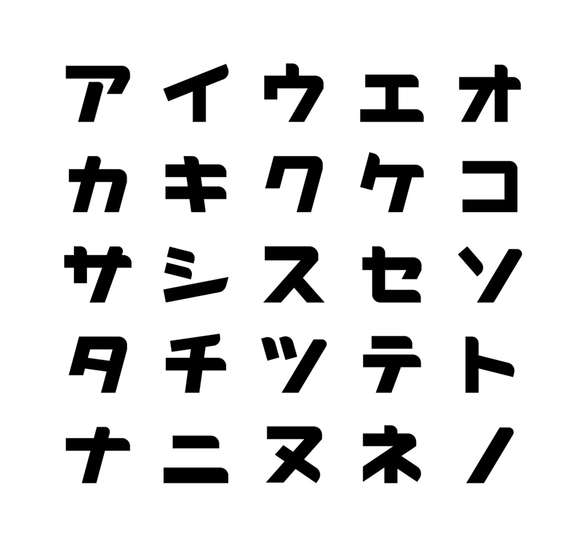
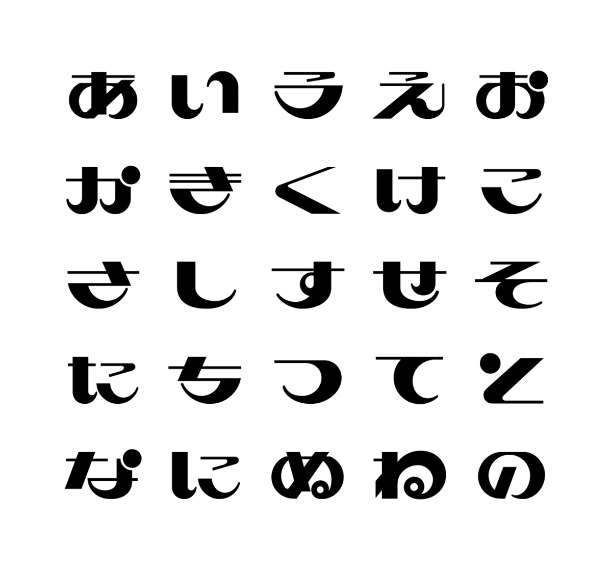
They studied graphic design in an art school in Japan. They were already interested in typography, especially old ones they saw in the city they lived in. They gradually started taking photos of them and analyzing their pattern in a mission to preserve these old neglected fonts in cities. They then reproduce them as open source typeface that is available to everyone for use.
They weren’t interested in, or at least conscious about, the urban space where these fonts “live”. Though, they knew in which neighborhoods they most likely find good interesting fonts with personalities. They’ve frequently visited Asakusa, one of the oldest neighborhood in Tokyo, for instance.
“We are interested in the texture of these typographies, which are accompanied with the buildings and its environments - their materials, characters, and feelings," said Shinya Wakaoka, one of the three directors of the project.
Interesting neighborhoods have interesting text in their spaces
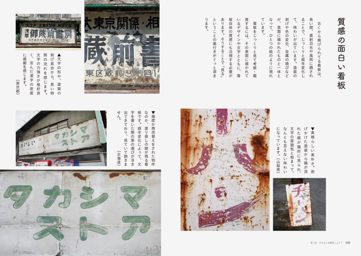
Most of the Noramoji happen to be from the post-war period. They represent certain characters that are specific to the era, Shimohama says. "Black markets that are created in a post-war era resulted in many subsequent small businesses. The storefront and posters they created back then have completely different characters compared to the mass-produced, streamlined typefaces that are created by marketing/advertisement companies."
"Architecture and its buildings reflect how people live and use the space. In a similar manner, people use texts to communicate and convey their messages. The shape of texts, and its usages, show the character of people and their place. They could be subjective and personal."
Thus, by observing the typographies, they can also detect the character of the place.
All the big cities, not only in Japan but everywhere in the world, are becoming homogenized due to globalization. The mode of expressions, including typography, are becoming standardized too. "Interesting, unique neighborhoods tend to have interesting texts and their variations. Standardization of cities are shown in the standardization of its texts, too," says Nishimura.
Lessons for architects
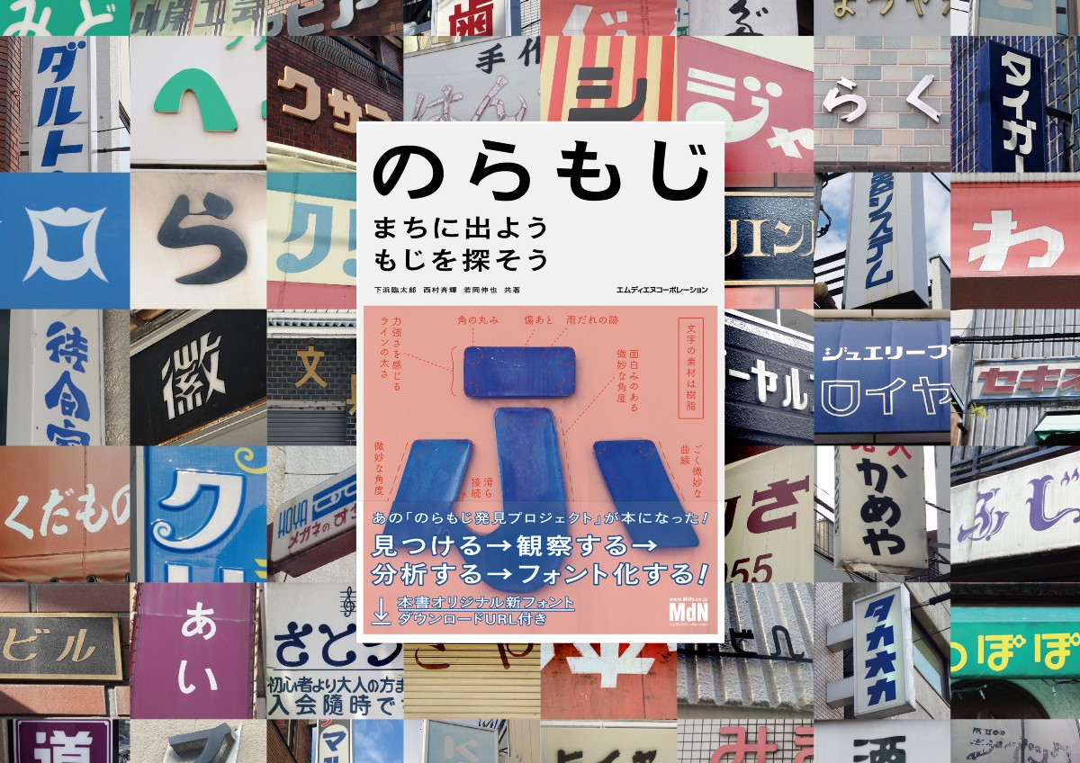
The NORAMOJI Project has published their first book in 2017. Their goal is to invite more people to get lost in this charming world of texts in our cities. All the profit are given to the owner of the storefront signs, helping the fonts to survive and find its new home.
Urban typography might not be their expertise, but architects and planners might have a lot to learn from it. A good typeface creates an emotional response in relation to the message it is conveying, and good typography creates a sense of place, invoking history, reflecting changing lifestyles and trends, and influencing people’s behavior. Some architects even dislike the usages of posters and signs on the surface of their design. Yet, it might be time to acknowledges the importance of typography as an essential factor in our cities.
All images and video by NORAMOJI Project
> via NORAMOJI Project